How to design your own logo

generic-filler-2.jpg

7 steps to designing a logo

Step 1: Think about your why?  Where do you want to see this logo? What is your target market? How do you want to position your business? Will you be targeting the high-end or a budget market? These questions will make a huge difference in the “feeling” of your logo design.

Step 2: Now that you have thought about your target market and your place in the market, it’s time to discover more about your competitors. Do you want to stand out and highlight your point of difference? Or ride the coat tails of a successful business model? Regardless you want your logo to speak to your target audience and look awesome (preferably better than your competitors).

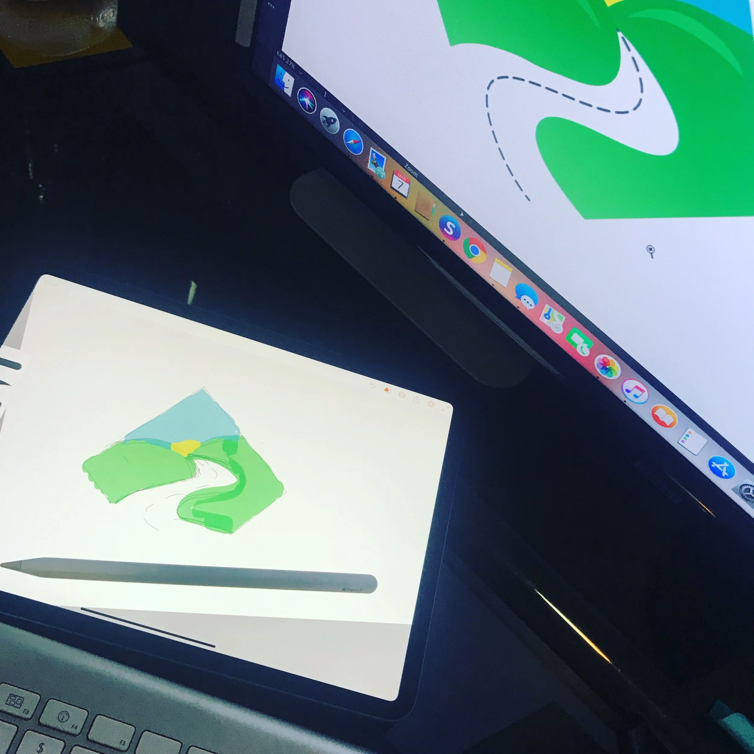
Step 3: Create a mind map of key words and the business name to create feelings you want the logo to invoke. Do some research on Pinterest or your favourite competitors to see what they are doing. Now for the fun bit… start drawing out some rough ideas - at least 10 - 20 little sketches. Always start in black and white, if a logo doesn’t work in black and white it won’t work in colour! This step may take a few days and ideas and inspiration can pop up at any time (for me its usually just before I fall asleep or in the shower).

Step 4: You should by now have narrowed down a couple of favourites that you want to explore a bit more. Take a photo of them and upload them to your computer and into any vector software you have. (I usually draw them up on the iPad first in Adobe Illustrator* before hitting up the computer).

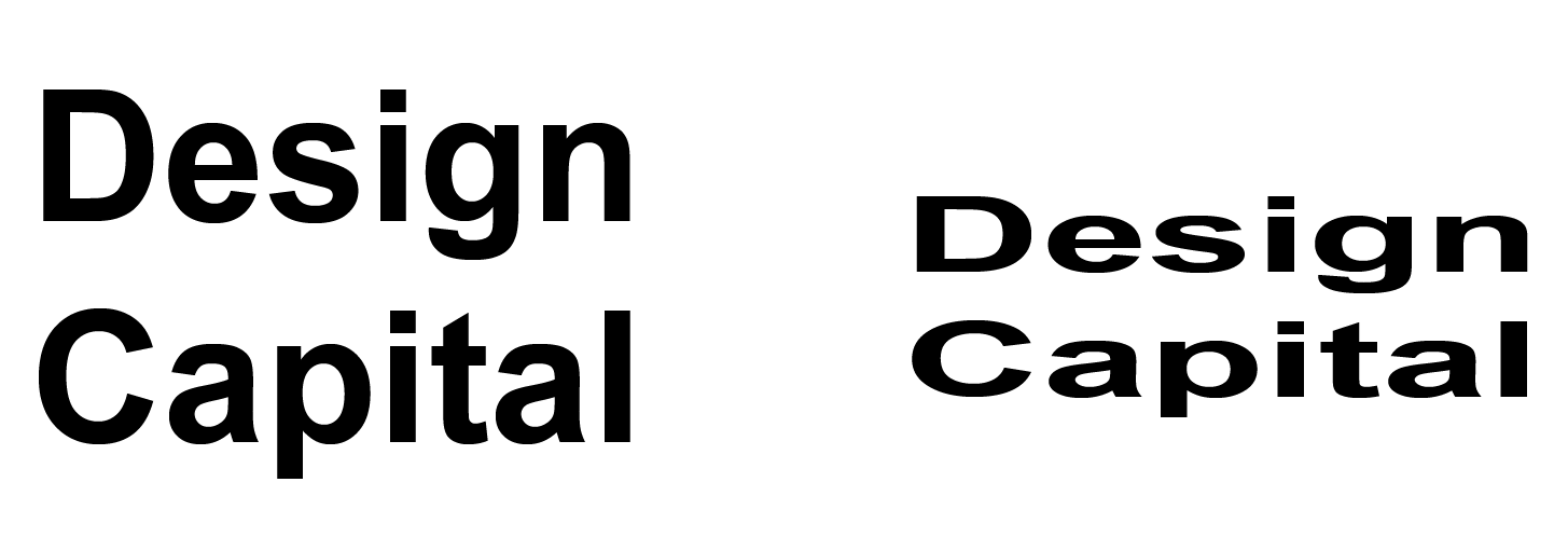
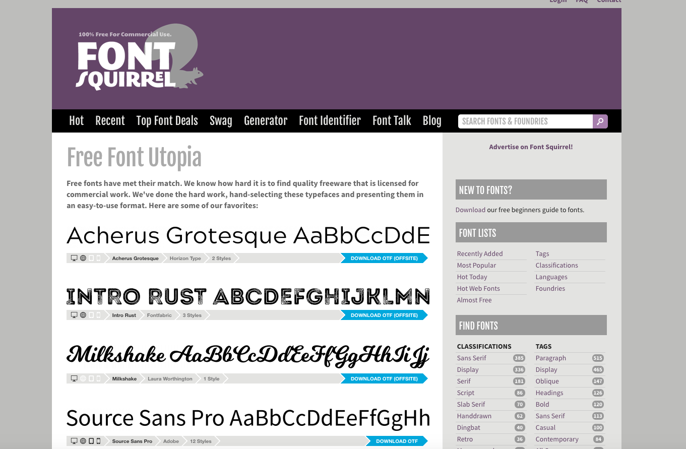
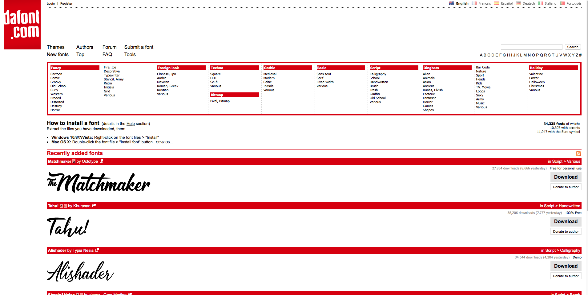
Step 5: Once you have your ideas up in the computer in a usable way, you can start experimenting with fonts. Choosing the correct font is a very important step. Fonts can make or break a logo design. You should choose a font that compliments the logo and that is appropriate to your target market. You can get free fonts but its only for personal use - you will need to purchase a font that you decide on to ensure you can use it in your logo.

Step 6: Pick some appropriate colours. Colours can have a heap of different meanings behind them, especially from a cultural perspective so make sure you do some research into colour theory for your specific target market. 

Step 7: Evaluate the logos you have created and ask yourself these questions: 

  • Is the logo unique?

  • Is the logo memorable

  • Is the logo appropriate to the target market?

  • Does the logo reflect your brand?

  • Is the logo timeless?

If the answer is no to any of the above, you may need to revisit some of the steps above.  

To get your logo right yourself will take a lot of time and effort, perhaps even sleepless nights as you think of ideas and wonder how you are going to make your vision come to life (and learn about the computer programs to produce it). You will need a lot of patience and time to create a unique logo that you can be proud of and use every day. 

Of course there are other options to think about, your time is valuable and a professional graphic designer can bring your vision to life a lot quicker than you are likely to, which will save you time and money. If you are not going to be dabbling in graphic design every second day the effort you will go to may be better spent on what you are good at - running your business!

Design Capital specialises in Logo design and branding, If you would like to find out more, call 0421 300 972 or email: hello@designcapital.com.au.

*Adobe Illustrator is the most popular tool for a professional graphic designer and is the industry standard. It gives the user all the flexibility to really make the most of creative designs. Word of warning though, you may need to invest in some serious time and dollars to truly get the most out of Adobe Illustrator.

I’m a tradie, do I need a logo?

Short answer is yes of course you do! 

I get it, most of your work comes from referrals? Yes, but other customers still need to find you and best of all remember you. You need to be noticed and remembered.

Christie and Steve from Voltair

Christie and Steve from Voltair

How can you get noticed in such a competitive market? 

Having a professional logo designed is as important as the professional job you offer. You want to portray quality?  You need a good quality logo and branding to help do the talking for you. 

There are so many opportunities to get your logo and business name out there in a memorable way... for example, if you are a tradie that regularly does work on people’s houses, you could get  FREE advertising by having your work vehicle designed with your logo and contact details so potential customers driving past remember you, team that up with some matching uniforms and you’ve got yourself a winning combination. Check out Voltair Air conditioning, their branding is on point and its consistent from their website to socials to uniforms to vehicles!  And how about an A- Frame sign that you can put out the front to remind potentials what you do and who you are. 

Have a strong social media presents: it’s free to set up all of the socials and free to join local Facebook groups. There is always someone needing a tradie just like you. Before and after pics are great! Everyone loves them! Take photos of the progress and behind the scenes. Make sure your branding is consistent and put your logo on all your images and post regularly. Brand recognition is so important because it’s reminder of who you are and what you do and sets you apart from your competitors. 

Set up a google my business account and don’t be shy to ask customers to leave a review. This creates confidence in your workmanship, and proof of your quality work and skills. 

After you have finished a job make sure to leave a quality business card or even a business card magnet, so your customers can easily remember you, use you again and refer you to their friends. Remember to be consistent and matchy matchy, it builds trust and creates pride for not just yourself but also your employees. 

We have a range of tradie branding packages available to help you on the right path to branding success, designed for the busy tradie, that include: 

  • Custom designed logo

  • Matching business card design

  • 500 premium printed business cards

  • Social media header design

Optional extra add ons

  • Matching Xero or MYOB invoice header

  • A- frame design and printed

  • Custom vehicle wrap design

  • Interactive Email signature

  • Magnetic business cards

  • Social media templates

If you would like to find out more, call 0421 300 972 or email: hello@designcapital.com.au

My opinion on the Coon Cheese rebrand

image: https://www.saputodairyaustralia.com.au/en/our-company/newsroom/introducing-cheer-cheese

image: https://www.saputodairyaustralia.com.au/en/our-company/newsroom/introducing-cheer-cheese

I have been asked a couple of times what my opinion on the Coon cheese rebrand is. 

Well, first off I actually wouldn’t consider it a rebrand, its simple just a name change. What do I think of the new name? I don’t mind it, I have thought for a long time that the previous name was offensive and it should have been changed a long time ago. Yes yes, I know it was named after, Edward William Coon back in 1926. But at the end of the day, if even one person is offended by it then it should be changed. I’ve been watching social media and there has been a lot of rants about it being the wrong move for the company and political correctness overload, and they have threatened to boycott the company… well those people likely don’t even buy it, and were never going to be loyal customers anyway! 

So back to the name change… CHEER…I really like it! Its obviously cheerful and its almost CHEESE. It goes great with the new slogan CHEER Cheese celebrates the “extra little bit of happiness” found in your every day. I like that it has also start with a C and have 2 Es! (I feel another slogan coming on … !) 

The treatment of the actual logo is what has impressed me the most… They could of gone for a complete rebrand – whole new look, new logo, new colours, new name… but sensibly they didn’t! I think it took some restraint to keep the branding exactly the same, it’s seamless, and clever! If you were a 4 year old and couldn’t read… you would still recognise it as the cheese you love! That’s clever! Brand recognition is everything and their loyal customers won’t care about the name change, they only care about the cheese inside. 

You can read the media release here.

What do you think of the new name?? Will you still buy it? Comment below.


How to survive a lull

the-great-may-dry.jpg

5 ways to stay calm during a work drought 

You know how it is, the beginning of the year is always full of hope and full of work, your calendar and white board is booked up for months, you are panicking thinking how are you going to get through all this work...then April comes and goes and so does the work, I call it the “Great Dry May”. For me it’s always May! Back in the day I used to panic and think I used to think this is the end...I’m doomed! 

But not anymore, I’ve been in business 9 years this year and survived just as many “Great Dry Mays”! I now use the great dry may to plan ahead with when thing inevitably ramp up again. 

Here is 5 ways I stay calm in a work drought.

  1. It’s all those blog post you wanted to write all year but haven’t had time. (Like this one). Get some topics written a schedule them in to publish over the next few months so you don’t have to think about it when work picks up again.

  2. Update your website with new work, maybe change a few things up, keep it fresh. I’m going to change a few images and add some new work to my portfolio that I never have time to do. Don’t forget to update the years you’ve been in business for of years of experience.

  3. Make a social media plan, break it up in to events for each month then break it down again in to weeks of days, like the blog post, schedule these to go out so you don’t have to think about it. TIP: you will get a better reach to schedule direct from the app rather than using a 3rd party app. 

  4. Update your skills and learn something new. That’s one thing that no one can ever take from you is knowledge. Udemy have some great short courses so you can learn something that will benefit your business. Skillshare is also great. I use Lynda.com a lot and if you have a library card you can usually access it for free. I’m actually taking it one step further and I’ve signed up to do History of Art and design through open university. I can’t wait! It’s something I’ve wanted to do for a long time.

  5. Contact some past clients and ask them if they need any help or know someone that does. It can’t hurt to send out a newsletter to let people know that you have a rare clear calendar and recommend clients get in touch before things pick up again in the new financial year.

  6. Maybe its time to think about a rebrand? Shake things up a bit? keep it fresh? Please get in touch if you want to have a chat to me about your options of rebranding your business, its not as scary as it sounds! this could be the perfect time. Click below to “get in touch”.

Just remember things will pick up again and try to relax, get some exercise and enjoy the downtime while you have it. 

*Disclaimer: I'm a great graphic designer, not a copywriter - spelling and grammar is not my thing. See this post for what it is...An extremely passionate graphic designer, that wants to share her knowledge with you (possibly with a couple of spelling mistakes)!

My logo design creative process.

I often get complemented on my process so I though I would share it with you so you can see how special it really is. Its taken me a few years to perfect and Im quite proud of it.

Step 1 - Initial contact.

When it comes to money, I don’t like surprises, so Im very clear upfront how much your investment is, I do this is the form of a proposal that explains my fees and terms and makes everything really clear before we even start work on your new branding.

Step 2 - the design brief.

This is the fun bit, I give clients a compressive questionnaire to fill out that asked lots of relevant questions. Like who your target audience is? and a little bit about your business? I will also ask about what kind of logos appeal to them and the most important question…what they don’t like! I can get more info out of that one question than any other. At this point you will also have a option to book in for a zoom meeting (or phone).

Step 3 - research and development.

This is when I sit down with a cuppa and go through your answers, usually with my iPad so I can sketch up ideas as I go. I will also research your business competitors and your target audience to see whats trending and how to stay fresh with in your industry. At this point I will usually want to have a quick chat with you so we can discuss your answers and answer any questions that may not have been clear.

Step 4 - iPad to computer

Once I feel like I have everything I need, I will revisit the sketches I did while I was on the phone to you. I will transfer them to the computer… this is my favourite bit. I LOVE seeing them come to life. I will usually have a few ideas, some will work and others wont. The trick is knowing what works and that takes experience.

1CB7FB77-4406-4332-BC82-AB67CF4ABDD4.JPG

Step 5 - does it fit the brief?

Once Im happy about 2 of the designs (This is the important bit I never have a favourite). I always ask myself these questions:

  1. Does this logo fit the brief?

  2. Would I be happy if you chose either of these logos?

  3. Would I put it in my portfolio?

If the answer is No to any of these questions I will start again! I'll never present a concept that I’m not happy with.

Step 6 - presentation

The presentation is were things really get exciting. I use the logo concepts Ive created for you and mock them up into real life situations for you. So you can see how your logo concept will look on business cards or on the side of a car. This really helps to make your decision easier and usually minimalists any changes. I'll include a rational of why I have designed what I have and why I have chosen the colours etc. The presentation will be sent to you for feedback.

Card 5115 2018-12-13.jpeg
Van 0958-1 2018-12-07.jpeg

Step 7 - refinement

I'll ask you to chose your favourite and encourage you to provide feedback or any changes.

Step 8 - Final Artwork

Once the refinements are done and you are 100% happy with your new logo. I will finalise the logo files and get stated on the rest of your branding. You can start showing off your new logo design!

Checkout more about branding and logo design here.


To discover what I can do for your business book in a FREE 20 minute consultation today or if you want to take things a little slower - fill in the form!

*Disclaimer: I'm a great graphic designer, not a copywriter - spelling and grammar is not my thing. See this post for what it is...An extremely passionate graphic designer, that wants to share her knowledge with you (possibly with a couple of spelling mistakes)!

Celebrating 9 years.

My honest recount of starting a business without any clues

This was my first logo Donnas Creations…seemed fitting at the time.

This was my first logo Donnas Creations…seemed fitting at the time.

9 years ago I decided to start my own business. In hindsight was a crazy thing to do! I had 2 little boys 3 and 1 and was expecting my 3rd in a couple of months time. 


To be perfectly honest I didn’t really take it seriously at the time, it was just something for me to do while I had babies. I always planned on going back to the workforce it was my way to stay current as a graphic designer - that was my biggest fear! Technology in the design and graphics world changes so quickly I know I would have found it really difficult to reenter the workforce after having time off to have children. Mothers guilt was huge… Not to mention trying to balance a 5 person family (3 under 4).


It was around the time that Facebook had just started to explode, it made the world a much smaller place, I could easily reach clients all over Australia and overseas, real clients that wanted my help creating flyers designs and a few logos. It started out small but then those clients recommended me to their friends or people they knew and before I know it I was busy, like really busy! I worked when I could… usually, after the kids had gone to bed or on the weekends when my hubby was home. I was stressed, I was exhausted! My business was running me! It was around this time I decided to rebrand myself, I decided I really wanted to focus more on branding and logo design for small serious business (like mine). I reassessed my pricing structure stopped working weekends/evenings and my business started to work for me. I only work for clients that I want to work with and that have similar values to me.


Now after 9 amazing years I can honestly say it the best and the most challenging thing I have ever done. And I pretty sure I can proudly say that I run a successful graphic design business! It's taken me a while but I do now consider it a serious business and never a hobby! 


I have worked with hundreds of clients over the years, most of them are still clients to this day. I love it when a past client gets in touch and wants to rebrand and thought of me or say "hey do you remember me?".... of course, I remember each and every client I have ever worked with and grateful and excited when they want to work with me again. 


Thank you to every single one of you. XX

Cheers

Donna

donna.png
 

To discover what I can do for your business book in a FREE 20 minute consultation today or if you want to take things a little slower - fill in the form!

Alternatives for horrible fonts

It's no secret that I LOVE fonts! Fonts are kind of like shoes, and I LOVE shoes too! Different uses for different situations. You wouldn't wear sneakers to a formal event, just like you wouldn't wear heels to the beach!

Now, this post is not going to be a font bashing, as I said, I love all fonts, but I am going to suggest some alternatives to some of the most talked about and disliked fonts in the industry. These are common fonts, standard to most computers. I'm sure you have heard about them and probably used them. 

220px-ComicSansSpec3.svg.png

Comic Sans

All primary school teachers will be familiar with good old "Comic Sans". It's such a fun and casual font and 100% appropriate if that's the message you want to portray. It's a very popular font for people working with children because it's easy to read. However, The reason it's so un-liked in the design community is because of it's passive aggressive nature and Its overuse in getting a serious message across is quite comical. For example using it for a WARNING sign!

Before you select comic sans for your next project, try one of these alternatives first.

Action Man is a great alternitive to comic sans. Use it for main heading only - not body text. Remember it is a fun font so use it in a fun way! If you have a serious message to get across dont use this font!

Action Man is a great alternitive to comic sans. Use it for main heading only - not body text. Remember it is a fun font so use it in a fun way! If you have a serious message to get across dont use this font!

Gosmick sans is also a great alternative to comic sans. Its still fun and you could get awsay with using this for larger text areas. 

Gosmick sans is also a great alternative to comic sans. Its still fun and you could get awsay with using this for larger text areas. 


Curls Mt

Hmmmmm...what can I say? Look let's be honest here...we are amongst friends. And friend don't let friends use Curls MT...there is NEVER a reason! Its been overused so much, don't worry I've used too (but I was in Collage and it was the 90's...that's my excuse!), if you feel you HAVE to use this font...like its the only font you have...FOR THE LOVE OF GOD don't use it in all caps

My mum always taught me, if I don't have anything nice to say, don't say anything...

So here are some alternatives to try before you are tempted to select Curls MT! 

 
You want something curly...you can still have curly! This is a much better alterntive to "you know who"! 

You want something curly...you can still have curly! This is a much better alterntive to "you know who"! 

 
clicker-script-font-1-big.png

This is a lovely script font and a great alternative to Curls MT. Like I've said 1000s of times, don't ever use it in all caps. and body copy, but headings and logos are fine. 


Papyrus

Wow, ok...Papyrus! I always crying when I see this font and even more so when I see it used in inoproprate ways! I actully saw this font in a logo for a womens fashion boutiqe in a VERY expensive area!  

You may think this is an innocent "earthy" font with its rough edges its a popular font for creating an healthy image. But seriously its been done to death! There is soooooo many other fonts you can use top get the same message accross!

Consider these for your next healthy project! 

220px-Papyrus_Font.svg.png
This is a great alternative it you want an earthy hand drawn font feel, there is so many better fonts out there than Papyrus.

This is a great alternative it you want an earthy hand drawn font feel, there is so many better fonts out there than Papyrus.

Papyrus was actually created to mimic the letter forms of ancient parcment paper, so if thats the look you are going for, try this font for your next project. 

Papyrus was actually created to mimic the letter forms of ancient parcment paper, so if thats the look you are going for, try this font for your next project. 


There you go guys, some alternatives to some much despised fonts! Now there is no excuse and you can delete them from your system so you don't accidentally use them. 

All of these font alternatives I have sourced form one of 3 websites. You can read more about where to get free fonts here: 3 BEST FREE FONT SITES

*Disclaimer: I'm a great graphic designer, not a copywriter - spelling and grammar is not my thing. See this post for what it is...An extremely passionate graphic designer, that wants to share her knowledge with you (possibly with a couple of spelling mistakes)!

How to spot a fake.

1477405_1127392380625628_8880852028690463696_n.jpg

I'm constantly seeing people offering logo designs for ridiculous prices. I get it! It's totally tempting! Its "just" a logo right? Wrong..a logo is one of the most important aspects of your business, It can make or break your business, especially in that fragile first year, I understand that costs are tight, but if you are going to put all your trust in an amateur you better understand what you are getting into and why this could be a costly mistake.

Here are a few questions to ask your "designer":

1. Where does your designer work? What country? Are the timezones the same? Will you have difficulty communicating? 

2. What qualifications or experience do they have? When you engage a designer you are getting the years of accumulated experience and qualifications. This can amount to significant expertise to make your experience worry free, from designing branding to magazine layouts to dealing with printers - this could save you lots of headaches in the future.

3. What questions are they asking you? A good graphic designer will give you a list of questions about your business and your target market? Who your competitors are? They will get to know you and get to the soul of your business. A graphic designer is NOT a mind reader but an experienced one will get in your head, know the right questions to ask and create the perfect logo that will appeal directly to your ideal customer. 

4. What file types are they going to give you? A sure way to spot an amateur is if they can only provide you with a JPG image or some other raster file of your logo or there are images in your logo. Images in your logo are going to cause you problems later if you need to enlarge your logo, print it or use it anywhere that it wasn't originally intended for.  Ideally, you want your logo to be supplied as vector PDF and an EPS, Click here to find out about raster and vector files.  

5. Find out what program they will be designing your logo in? If its anything but Adobe Illustrator you are dealing with an amateur. Adobe Illustrator is the professional standard for creating logos and any other vector graphic.

6. Do some research, read their reviews check out their portfolios. Make sure their values align with yours and most importantly - you like their work. Make sure, their logo designs don't have a "cookie-cutter" feel to them, you don't want to end up looking like everyone else.

7. If you can, have a chat with them to see if they know their stuff. Any good graphic designer would love to have a chat with you about graphic design and what to expect, In my case I'm so passionate it's all I talk about!

Those are the questions I would recommend asking before you engage a "graphic designer". 

I'm always happy to chat over a virtual coffee. Click below to go directly to my private calendar and book in a time. Checkout more about branding and logo design here

*Disclaimer: I'm a great graphic designer, not a copywriter - spelling and grammar is not my thing. See this post for what it is...An extremely passionate graphic designer, that wants to share her knowledge with you (possibly with a couple of spelling mistakes)!


Design no nos!

This blog post is going to take me all the way back to 1998 when I was a student of graphic design. Listening to my lecturer bang on about design rules.I clearly remember him saying to us - "There are rules in design!" He encouraged us to break these rules...But he said you need to know them first before knowing when to break them. I'm going to share with you some of these rules that are NEVER EVER to be broken!


Squashing or stretching a font or Logo!

This is NEVER acceptable and I'm pretty sure a designer dies every time you do it! Please don't do it, choose a different font! This is a sure way to tell an amateur from a professional. As for a logo, a designer has spent hours designing the perfect logo for your business. It's never cool to try and fit a logo that has been designed to be horizontal into a square space. Most awesome designers would have given you a few different versions of your logo. If not, ask your designer to recreate one that will fit in the space you need it to fit. Or contact me and I will do it for you.

Perfectly formed letters of Ariel V's a horrible stretched version.

Perfectly formed letters of Ariel V's a horrible stretched version.

Again, perfectly designed logo V's a horrible squashed version.

Again, perfectly designed logo V's a horrible squashed version.


Bad Kerning!

What is kerning I hear you ask? Kerning is the space between letters. Most good fonts will consider the letter spacing when it's designed. You usually won't need to worry about it, but some free or cheap fonts can be really bad and needs to be kerned by eye. Check out these hidious examples of really embarrasing kerning fails below. Click here for this great game to test your kerning skills - its fun, comment below what score you got! http://type.method.ac

Little less space between the E and the R would of done the trick here! Photo credit:https://imgur.com/AZeDmcm

Little less space between the E and the R would of done the trick here! Photo credit:https://imgur.com/AZeDmcm

Some more space between the S and E would of made all the difference. Photo credit: https://imgur.com/N7qE1Hh

Some more space between the S and E would of made all the difference. Photo credit: https://imgur.com/N7qE1Hh


microsoft word for design!

Microsoft word is amazing and its no surprise that its one of the most popular programs. What's it's not, is a design program!

For reasons I don't understand there are options in Word to use "Word Art"...no don't do it! If you are or have tried to design a logo or anything for that matter...you really need my help! Please get in touch and suffer no more!

Screen Shot 2018-04-04 at 3.44.05 pm.png

Clip Art.

Like Microsoft Word, click art has its uses. When I say clip art I don't just mean those you can freely get from any Microsoft program, I also mean images you have found on the internet (just like fonts, always check the licensing).

And it looks ugly!

And it looks ugly!

Clip art is NEVER to be used in a logo. For a few reasons;

  • They are public images, meaning anyone can use it.

  • It's not unique to you or your business.

  • There is nothing stopping someone else (like a competitor) using that exact same image for their logo too.

  • You cannot trademark it.

  • If you have found it on the internet, it may be someone elses work and covered by a copyright, therefore illegal to use, it's considered stealing!


Too Many fonts!

I've actually covered this before in a previous blog post. But it doesn't hurt to go over it again.

I like to use 2 maybe 3 max that complement not compete with your logo. And it would usually be from the same font family. Like a regular and a bold or a regular and italic or all 3. Check out Open Sans to see what I mean about font families (it's also referred to as styles). By sticking to the one font family you are guaranteed to look professional. Avoid using anything too light because it will be difficult to read if it's going to be printed.

Design-Rules-long.jpg

Script fonts in all caps!

Oh I almost forgot about this one, but its the one rule that really grates my goat! So many people make the mistake of doing this, I see it way more often than I would like! Script fonts are ornamental in nature and the way they are designed to work, is with a lowercase letter. Displaying them in all caps is a sure way to spot an amateur and make your text illegible and quite horrible. The exception to this would be with a monogram. Monagrams are designed to work together as initials and not as a word.

Screen Shot 2018-04-04 at 3.23.24 pm.png

CENTRED text

This is an interesting one, because sometimes even I am tempted to centre text, but as a rule its considered a "NO NO", unless you are designing a certificate or maybe, if appropriate, a menu. Centred text looks amateur and it's ugly and worst of all it's difficult to read. Text alignment is important for guiding your reader through the text.

Screen Shot 2018-04-04 at 3.30.01 pm.png

If you are still not sure if you are breaking any design rules, I'm always happy to help. Checkout more about our graphic design services here.

*Disclaimer: I'm a great graphic designer, not a copywriter - spelling and grammar is not my thing. See this post for what it is...An extremely passionate graphic designer, that wants to share her knowledge with you (possibly with a couple of spelling mistakes)!

How to keep your branding consistent. - Consistency is key!

The biggest mistake some business' make is not being consistent. Being consistent can come in loads of different forms. From keeping your pricing consistent to keeping your branding consistent. I know a lot about branding so this post is going to focus on branding consistency!

If you have had a logo designed by me I would have provided you with a style guide. Any awesome graphic designer should have given you something like this. Your style guide is used to keep your branding consistent. Little things like facebook ads and supporting images you should (if you have time) be able to do yourself. The style guide usually includes the colour breakdowns for your website and other branding. Also a suggested supporting font, that goes well with your logo and branding.

Example of a style guide.

Example of a style guide.

I know fonts are awesome and I know, there are so many choices. BUT DONT DO IT! You already have your awesome logo, that should be the star of your branding! By using a "hey look at me" font you are taking the attention from your logo and confusing the message. I like to use 2 maybe 3 max that complement not compete with your logo. And it would usually be from the same font family. Like a regular and a bold or a regular and italic or all 3. Check out Open Sans to see what I mean about a font families (its also referred to as styles). By sticking to the one font family you are guaranteed to look professional. Avoid using anything too light because it will be difficult to read if its going to be printed.

It's really easy to look super "profesh"!

Ok, so I'm going to give you a few tips to make sure you always look professional. Like I said before, a lot of the small things like facebook ads etc you can (if you have the time) do yourself in some awesome online programs such as Canva or my favourite Adobe Spark. If not, you know I'm always happy to help. :)


KEEP IT SIMPLE

Don't pick 6 different fonts and 20 different colours, because you think they look good. Choose 3 colours from your logo and stick to them... If you don't have a style guide and you are not sure what colours are in your logo, there is a great tool you can use for that called: Pick Pick (mac) there are plenty of others, but I like that one. It gives me the breakdowns of the colours in CMYK, RGB and the hex codes.

 
Screen Shot 2018-03-16 at 2.30.47 pm.png

If consistency is your pain point and you are just not sure how to keep your business branding consisting. I'm happy to help. Click below to go directly to my private calendar and book in a time for a chat. Checkout more about branding and logo design here.

*Disclaimer: I'm a great graphic designer, not a copywriter - spelling and grammar is not my thing. See this post for what it is...An extremely passionate graphic designer, that wants to share her knowledge with you (possibly with a couple of spelling mistakes)!

3 best free font sites

Choosing the right font for your branding is important business, especially when there are soooooo many choices.

Where to get more fonts: There are a lot of free font website that you can view and download your favourite font. But beware, there are a few things to keep in mind when you download a font from the internet.

Sometimes they can carry viruses with them so make sure you have some virus protection installed on your computer.

They could be "FREE" but subject to a licensing agreement that says for personal use only... you cant use them for commercial use. Which means a logo or on your website or anything to do with your business. Remember, the person that designed the font needs to make a living somehow too.

The 3rd thing to remember is as a designer, I have bought (yes bought!!) hundreds and hundreds of fonts over the years, I have bought them so that I can use them in clients logos and branding etc, however Its illegal for me to distribute those fonts. If a client wants to use them on their marketing material etc, they will need to buy them themselves.


Some of my favourite (almost) free font websites:


www.fontsquirrel.com

Font squirrel is a great one, apart from having a super cute name most of the font on here are not only free they are commercial free, meaning you can use them for your business. Its super easy to use and the search is great and you can be as specific as you like. It also has a really great "testdrive" feature ao you can test out your font before you download it. 

Front-page of fontsquirrel.

Front-page of fontsquirrel.

You can also use a "test-drive" feature to see how your font will look before you download it.

You can also use a "test-drive" feature to see how your font will look before you download it.


Google fonts

I'm loving google fonts, not only is it super clean design its really easy to use. All the fonts on here a free and commercial free, meaning you can use them for any project you like. The search feature is great, it can be narrowed down to find the font that you need. You can view a sample of your font right there in the window without having to select it, change the size and font weight right there. Also you can change the background colour so you can see how the font will look when it's revered or on yellow...That's pretty cool! 

Screen Shot 2018-03-10 at 6.41.09 am.png
Screen Shot 2018-03-10 at 6.47.54 am.png

DA FONT

Da font is another great one, this one has been around forever, I remember using it when I was at collage 20 years ago, unfortunately back then there were very few font available for a mac, but that's not the case anymore, most fonts can be used on any platform. 
Is probably not my favourite site anymore, but it does have some wild and wacky font to choose from. I like that the categories are along the top so you can quickly get to the exact font style you are looking for, and the subcategory is great too, for example you wanted a script font that has a graffiti look to it you just click that category and you get loads of choses. 

Screen Shot 2018-03-10 at 7.16.30 am.png
Screen Shot 2018-03-10 at 7.17.00 am.png

So that's my favourites free font sites, whats your favourite font website? Comment below and don't forget to LIKE this post. :)


please remember to always check the licencing fine print before you download a font just to make sure you can use them for your project.

Vector v Raster

Screen Shot 2018-03-08 at 11.30.56 am.png

Vector V raster...who would win in a fight? Well, I'm sure the photographers out there will disagree when I say VECTOR for the win! Now you're probably thinking what the heck is she talking about raster? vector? 

Ok, so I'm sure you have heard of pixels? So pixels are what raster images are made of. Raster images are mostly associated with files like .jpgs or .tiff or .psd files, also photo editing programs such as Photoshop or Lightroom etc work using pixels. Think of a pixel as a dot! Raster images are made up of lots of different coloured dots to make an image. If the image is enlarged so are the dots! You might have heard the word pixilated before? Well that's what happens to an image if it were made too large and you can see the pixels. 

YUCK!! nobody likes exposed pixels! 

YUCK!! nobody likes exposed pixels! 

Ok so let's talk about what a vector image is, unlike raster images vectors are not dependent on pixels, they don't need them. Vector images are infinitely scalable to any size without quality loss or pixelation to any size! And amazingly the file size will stay the same whether its the size of a logo on a business card or a logo on a 30 metre billboard! AMAZING!! Vector images are traditionally created in professional drawing programs like Adobe Illustrator or Corel Draw or an oldie like Macromedia Freehand. You can pretty much do anything you want with vector files. If you want t-shirts printed or you car wrapped, the printer will ask you for a vector .eps version of your logo. Same with business cards, the printer will want a vector .eps or .pdf file. 

Ooooooo so smooth!

Ooooooo so smooth!


One thing that's important to know about vector v raster is you can convert a vector image to a raster (.jpg, png, bitmap etc) But you can't go the other way! 

If you only have raster versions of your logo or you're not sure what you have, click below to get in touch so we can chat about your options. 

Three signs your logo is due for a refresh.

A logo is one of the most important branding aspects of your business, but what if your logo is not working for you anymore? Would you know? Here are my three questions to ask yourself to determine whther you need a logo refresh. But first, let me explain what I mean by refresh... I don't necessarily mean a complete overhaul that's a bit drastic (although in extreme cases quite necessary).

#1 HAS YOUR BUSINESS EVOLVED?

Over time your businss can change and evolve, that's cool! When I first started my business back in 2010, I was designing invitations with a business name of Donna's Creations. Although it had my namesake, I didn't feel it was the right direction for me. I am a qualified graphic designer! I studied long and hard to become a graphic designer - not to design invitations! So I went back to what I know best and what I loved doing... LOGOS AND BRANDING! So I changed my business model and refreshed my branding to suit my target market and DESIGN CAPITAL was born! Since then my logo has changed slightly over the years, but still recognisable as Design Capital. It's nice to keeps things fresh...like a new pair of shoes!

So if your business has evolved and not it's not what it was when it started, it may be time to refresh your logo to make it match your current values, services and/or products. 

#2 IS YOUR LOGO OUT OF DATE?

If your logo is older than five years old there is probably a good chance it's out of date... Just like everything, design styles go out of fashion, for example, drop shadows and shiny bits and 3D looks were all the rage a few years ago, now companies are opting for a flatter and cleaner look to their logos (I actually notice this a lot with cereal packaging! maybe it's just me that's noticed things like that!). Also customers could perceive a business as out-of-touch with modern practices. Do you keep the same phone for more than 5 years? In most cases NO! Do you have the same hairstyle for more than 5 years...probably not! So why wouldn't you update your logo too? Keep things fresh, shake it up a bit...get excited about your business again and inject some life back into a dusty, tired old logo! Don't get me wrong, I'm all for timeless designs, but there is nothing wrong with a refresh to keep things exciting and fresh.

#3 DO YOU HAVE THE CORRECT LOGO FILES?

Ok well this one is interesting and I don't want to speculate on why you don't have the correct files or don't have the files at all! They could have been on that old computer you had five years ago. Or in some cases you may not have EVER had them or had competely useless files. You may have had a logo designed and only ever received .jpg files. Ideally when you have a logo designed by a professional you should get at least a few different versions of your logo, for example when I design a logo, included in the price the client will get a jpg and transparent png file, as well as a vector (that's going to be another post) .eps file and vector pdf. I would also usually supply a few different layouts of the logo for different uses, obviously, a long logo is not going to fit into a square space.  

Anyway, if you don't have these vital files, you will need to have your logo re-drawn by a professional so that you can continue using them. And while you are at it, why not give it a refresh.

As refresh should as simple and as subtle as maybe a font change but still keeping the essence of the logo. Some companies are even opting for removing some detail. The Google logo is a really good example of the evolution of a logo and it was quite subtle over the years and you may not have even noticed it happened. see below. 

Find more information about the google logo and Image sorted from http://1000logos.net/google-logo/

Find more information about the google logo and Image sorted from http://1000logos.net/google-logo/

*Disclaimer: I'm a great graphic designer, not a copywriter - spelling and grammar is not my thing. See this post for what it is...An extremely passionate graphic designer, that wants to share her knowledge with you (possibly with a couple of spelling mistakes)!

Don't let your ego get in the way of your brand.

Screen Shot 2018-03-08 at 11.39.04 am.png

Consider your target market very carefully. I have heard people say to me in the past that THEY love THEIR logo, but THEY are not THEIR target market and their business has suffered because of this.


When defining your target market you should consider: 

  • your current customer base and past customers
  • check out what your competition is doing - who are their customers? Sometimes its easier to look at your competition and figure out who they are marketing and who have they missed? 
  • think about their demographic, age, location, gender.
  • What about their personality? values? and interest?
  • It may even help to create a persona for your target market, give him or her a name, this will keep you on track and focused. 
  • and remember that YOU are not necessarily your own target market. 

These are the types of questions I will ask before I design your logo and really get a good understanding of your market and its objectives because what I truly want for you is: a brand that offers you the opportunity to enjoy effortless success while making a profound impact on the people who matter the most. Your customers. And I can help you do just that.

A logo could make or break your business. Please don't leave it to an amateur.

swapping ski gear for surf gear

Soul_GoldCoast_5.jpg

About 6 months ago, we made the (probably) spontaneous decision to move away from our beloved Canberra in search of a warmer lifestyle on the Gold Coast...I know! Crazy right? Well, not really, It kind of made sense to us. We go to the Gold Coast at least a couple of times a year. My hubby can work out of any airport and my business, Design Capital is portable, so why not! 

Let just talk abut "portable" for a second... The most awesome thing about living in 2017 is the internet OMG how awesome is it? You could be lucky enough to be working for yourself but feel constrained by location or you could be working for someone else in a boring uninspiraring office...WHY? when we are so lucky to be in 2017 and have the ability and technology to work ANYWHERE! ...gone are the days that you need to go into the office for boring waste of time meetings...you can Skype in your PJS on the beach! 

So basically this was the deciding factor for the move to the gold coast...Lifestyle! Don't get me wrong, I still consider myself a Canberran and Canberra will always have my heart, but for now I'm happy working out of to my frangipani aroma filled office over looking my pool...who knows where we will be next year! 

GOOD NEWS EVERYONE!!

So, I have some news!! a few weeks ago i got asked if I would like to do some teaching! Teaching graphic design at CIT....and I said YES!! Its only one class twice a week and shouldn't interfere too much with my Design Capital clients, so don't panic!!  I have been a graphic designer for almost 15 years, I never really considered my knowledge to be on any value, Its just something I do and don't even think about... but it is valuable and I have so much to offer and anyone who knows me or has worked with me knows how passionate I am about graphic design! Im really excited (and a little bit nervous) and can't wait for my first class this Monday! YIPPEE!!

As well as the teaching I will also be a student, as part of the teaching conditions is that I have a Cert4 in training and assessing, so the next few months are going to be quite full-on and exciting until I get my head around it and find my new normal.
I LOVE A CHALLENGE! BRING IT ON!!

CWB - business woman of the year.

Well, its finally happened, just in the nick of time (cut off was tonight) I finally put in my application to enter the Canberra Women in Business Awards for the category of Business woman of the year. This was actually a huge thing for me, I know if doesn't really seem much and it probably seems weird me blogging about it, but it's a huge deal for me. It would of been easier if I didn't apply because then I wouldn't win and to be perfectly honest I am more scared shitless of winning than I am if i don't (at least I won't have to go on stage and actually say something).

Im really proud of my application, its honest and straight from my heart, I took the time to really think about my business and where I wanted it to go in the next few years, and things that I think I need to work on.

So tonight I'm actually celebrating the fact that I entered, sometimes its good to step out side your comfort zone and just go for it! 

Win or not, its a win for me anyway. :)


my Social Media love/hate affair.

If you are like me you probably feel a bit overwhelmed with social media choices, or you just have no idea what is for what. I hate missing out on things so I feel I needed to be on EVERYTHING… but that just makes thing worse and I panic in the middle of the night thinking OMG I haven’t tweeted to my twitter in ages.

Well, I will tell you what I like and what works for me and my business…

I will start with my favorite Facebook. It’s my favorite probably because I know my way around, and it feels comfortable. And I guess I have a bit of affection with Facebook because 4 years ago when I first decided to go out on my own, I did it all through Facebook. (Before things took off and I needed a website) So anyway, I love Facebook for my business because it feels relaxed, my likers are like my friends and I really feel like I can tell them anything.  (ahhh!!)

Ok, next favorite is for sure Instagram! LOVE it love it! Maybe its because I’m such a visual person, who know? In saying that I have never actually had any business leads from it, but it is fun!

Next up is Twitter… Well Twitter and me never really took off, we have a bit of a lukewarm relationship and to be honest, I don’t really get it!! I’m not sure if I have had any work leads from it, in fact I’m thinking of breaking up with it for good.

Next is LinkedIn, now this one is interesting. It’s feels a bit like Facebook, but for grownups… It makes me feel like a kid that is not quite ready for the adult table at Christmas time. Awkward!!! It feels like everyone is showing off and using way too many big words. Just keep it real peeps! Relax! But in saying that I have actually had a few great jobs leads and some great clients out of it, you can join local groups and network that way. I don’t really give it as much attention as I should but I’m trying… Maybe I need to grow up a bit yet. ;)

Google+ … well, I’ve got nothing! I have an account that I have looked at maybe twice. We have no relationship! But I think I would like to get to know if better and I would really like to hear some positive reviews on the Google+ front.

Pinterest: I love it but I only really use that for inspiration and probably don’t give it the attention it deserves. #oneday

Anyway, I would to hear what works for you and your business? Is there something I have missed? (Remember I hate missing out) Tell me about your social media love affair. What’s your fav??